Your support helps us to tell the story
From reproductive rights to climate change to Big Tech, The Independent is on the ground when the story is developing. Whether it’s investigating the financials of Elon Musk’s pro-Trump PAC or producing our latest documentary, ‘The A Word’, which shines a light on the American women fighting for reproductive rights, we know how important it is to parse out the facts from the messaging.
At such a critical moment in US history, we need reporters on the ground. Your donation allows us to keep sending journalists to speak to both sides of the story.
The Independent is trusted by Americans across the entire political spectrum. And unlike many other quality news outlets, we choose not to lock Americans out of our reporting and analysis with paywalls. We believe quality journalism should be available to everyone, paid for by those who can afford it.
Your support makes all the difference.
A video for a rebrand of British luxury car brand Jaguar is being mocked online for showing models in brightly colored outfits.
The advery also lacks any image of a car.
The rebrand, which includes a new logo, is slated to launch Dec. 2 during the Miami Art Week, when the company will unveil a new electric GT model. But Jaguar Land Rover, a unit of India’s Tata Motors Ltd., has been promoting it online.
The Jaguar brand is in the middle of a transition to going all-electric.
“Copy Nothing,” marketing materials read. “We’re here to delete the ordinary. To go bold. To copy nothing.”
The promotional video, posted on X and Instagram, shows models dressed in futuristic brightly colored outfits walking in an alien-like landscape. “Break Moulds,” copy reads.
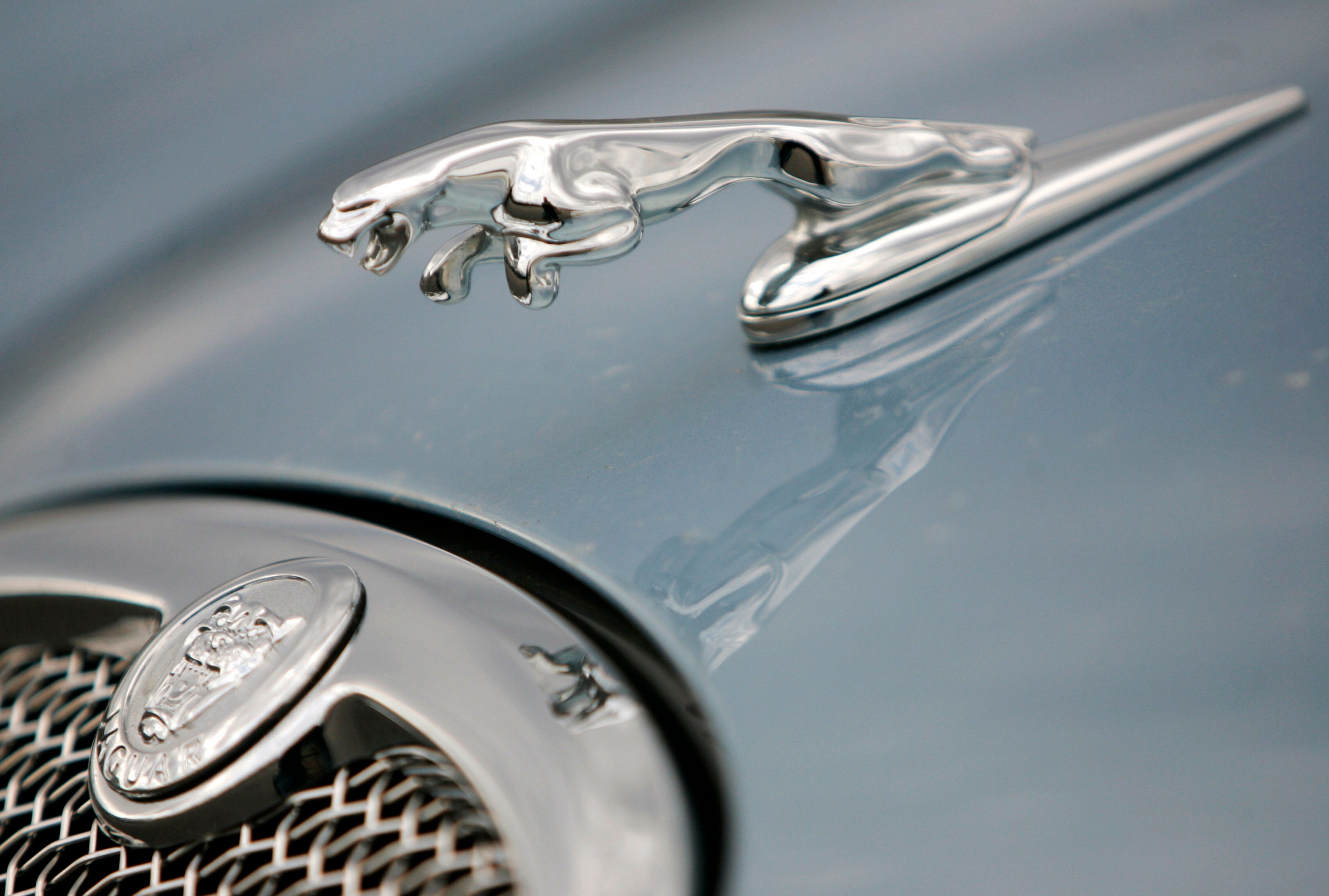
It drew ire online, with people complaining about the lack of a car and the confusing message. X owner Elon Musk wrote on X, “Do you sell cars?” People also complained about the new, stylized, logo. The “leaper” jaguar image has also been reimagined.
Charles Taylor, marketing professor at the Villanova School of Business in Villanova, Pennsylvania, said the promotional video strikes the wrong tone for potential buyers, and said the company is making a mistake by not using the brand’s heritage as an elegant British high-performance sports car in its marketing.
“If they came back with a really good electric vehicle, they could build on their prior image as opposed to really throwing out the heritage of the brand and going in this kind of direction,” he said. “It’s hard to see how the market of people that would like that approach is large enough for them to thrive.”
Jaguar Land Rover did not return a request for comment.
Jaguar managing director Rawdon Glover said taking new cars off sale was “intentional” as it looked to create a barrier between the old models and the new-look Jaguars.
He said: “We need to change people’s perceptions of what Jaguar stands for. And that’s not a straightforward, easy thing to do. So having a fire break in between old and new is, actually, very helpful.”

Gerry McGovern, chief creative officer for parent firm Jaguar Land Rover, part of Tata Group, said: “Jaguar has its roots in originality. Sir William Lyons, our founder, believed that ‘A Jaguar should be a copy of nothing.’ Our vision for Jaguar today is informed by this philosophy.
“New Jaguar is a brand built around exuberant modernism. It is imaginative, bold and artistic at every touchpoint. It is unique and fearless.
“We are creating Jaguar for the future, restoring its status as a brand that enriches the lives of our clients and the Jaguar community.”
Rebranding is a common tactic for companies seeking to spark sales. Campbell Soup Co. on Wednesday officially changed its name to Campbell’s Co., and companies like Airbnb and Instagram update their logos from time to time.
But if they strike a wrong chord, the result can be disastrous. Past rebranding failures include Tropicana changing its logo in 2009 to omit its trademark orange — it soon changed it back. And Radio Shack rebranded to “The Shack” in 2008, alienating its core shoppers, before eventually filing for bankruptcy protection in 2015.

